Get your copy of the 2024 calendar desktop background
The coveted 2024 Focal Point calendar is now available for download as a digital desktop for most common screen sizes and resolutions, including tablets. Discover a new project each month and have a handy calendar at your fingertips at all times! You can also request a traditional, printed version from your Focal Point lighting agent while supplies last. Download the current month in your preferred format now and remember to come back each month to discover a new project!

JANUARY | Lendlease Regional Headquarters
Lendlease's revitalized regional headquarters in midtown Manhattan’s MetLife Building reflect the development and construction company's commitment and dedication to placemaking. Located just a few floors above Grand Central Station, Lendlease’s New York office is a contemporary workspace that contrasts with the building’s historic façade and reflects the company’s long-held leadership of sustainable innovation in the construction and development industry.
ID+ Cylinders and Downlights, Seem 4 Pop Down Lens and Recessed, and Skydome LED provide comfortable illumination in the office, circulation, and amenity spaces where open, drywall, and wood ceilings coexist.
Architect: HOK
Photographer: Evan Joseph

FEBRUARY | 40 Skokie
Situated at the busy intersection of Lake Cook Road and Skokie Boulevard in the Chicago suburbs, Boulevard 40 is a multi-tenant office building managed by CBRE. It offers desirable amenities, including a recently renovated atrium and first-floor conference room off the lobby.
AirCore Bridge, in a fresh blue hue, creates an airy canopy that lets natural light permeate the conference room while absorbing sound reverberations resulting from the glass walls and other hard surfaces.
Architect: The Interior Design Group LTD.
Photographer: Robert Buyle Photography

MARCH | MarinHealth Medical Center
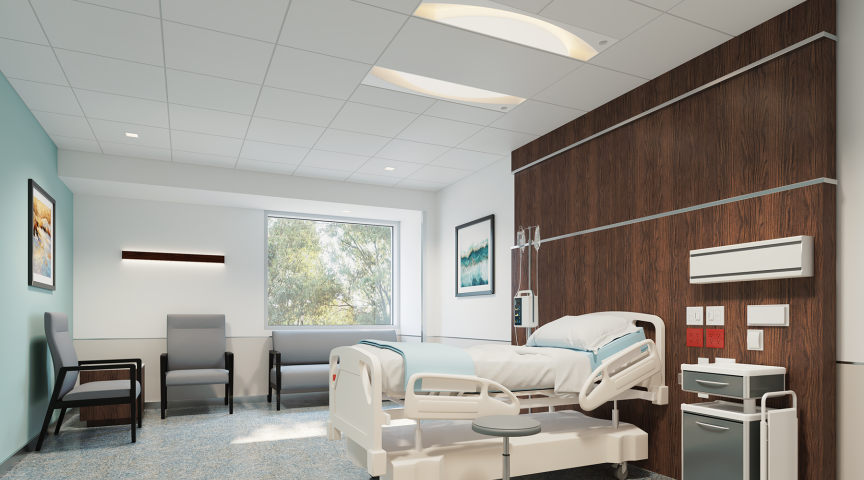
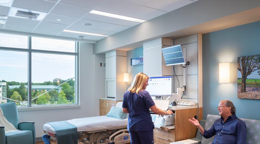
The MarinHealth Medical Center, formerly Marin General Hospital, merges hospitality with superior patient care by taking advantage of its beautiful hillside location where patients can recover in nature. From world class diagnostic and treatment spaces to comforting common areas, the design team created facilities and patient rooms with the latest health care technology, replacing a clinical look and feel with one inspired by a hotel stay.
Seem 4 Perimeter provides a glowing transition between ceiling and walls in corridors, waiting areas and patient rooms, creating a sense of space and openness. Seem 2 Recessed is arranged in a playful manner in drywall ceilings, enhancing interior design in common spaces.
Architect: Perkins Eastman
Photographer: Tim Griffith

APRIL | Cosentini Associates
Cosentini collaborated with MKDA Stamford to realize its vision for a flexible employee-centered workplace and Living Lab that optimizes team performance and showcases new advances in the firm’s sustainability, technology, and lighting practices. The design intention centered around flexible environments that provide universal access and comfort, opportunities to collaborate and socialize, and room for future growth.
Two rectangles formed of Seem 2 linear luminaires are suspended over the communal stair, the “spine” that connects both floors and encourages workplace connections, exemplifying how technical prowess can facilitate creative design. Painted to match the ceiling color, black ID+ 4.5" Cylinders with a non-glowing reveal support ambient lighting in corridors and open common areas with a subtle presence.
Architect: MKDA
Photographer: Alexander Severin

MAY | CoreLogic
A real estate data analytics firm with more than 5,000 employees, CoreLogic reimagined its headquarters through visioning and strategic programming exercises. The more interconnected and equitable workplace, exemplified by an amenity center that fosters community among employees and clients, helps better engage employees and establish a stronger firm culture and identity.
In the large amenity space that encompasses communal tables, a lounging area, booths that can be used for small group meetings or solo work, and a ping-pong table, acoustics could be an issue. Seem 1 Acoustic lit and unlit, in multiple shades of grey, dampen noise levels and reverberations and add to the visual appeal of the space. Square ID+ Downlights, offered with a wood installation kit, integrate perfectly in a wood canopy.
Architect: Smith Group
Photographer: Lawrence Anderson Studio

JUNE | Federation of Canadian Municipalities
The redesigned office space of the Federation of Canadian Municipalities embodies their business strategy, fostering a culture of collaboration, engagement, and innovation. The new office features abundant collaboration spaces, diverse environments tailored to different work styles, and contemporary design elements to make the space appealing and to enhance employee comfort and well-being.
Profuse daylight, as well as integrated lighting and acoustic ceiling systems support this goal. The simple design of AirCore Bridge in a dark gray PET felt and the perpendicular positioning of the arrays add interest to the ceiling while supporting optimal lighting and acoustics. Seem 1, with its slim profile, adds to the space’s modern aesthetic.

JULY | Daytona State College
The 74,000 sq. ft. Lemerand Student Center at Daytona State College offers students places to study, meet friends, eat, and relax. It is located in a building organized around a three-story commons that serves as the living room for the campus and overlooks the quadrangle.
Seem 4 and Seem 2, as well as ID+ 4.5" Round and Square Downlights dot the ceilings that frame the monumental 84-foot-tall entryway and the large diamond-shaped skylight that spills light into the space. The linear luminaires, downlights, and Nera are also used in several study spaces, offices, and classrooms.
Architect: IKON.5
Photographer: Brad Feinknopf | Joni Hoffman

AUGUST | National Police Federation
Located in Ottawa, the National Police Federal has a collective office space shared among members to suit the organization’s functions and roles. The design proudly pays homage to the rich history of the Royal Canadian Mounted Police (RCMP) and creates a sophisticated and welcoming environment.
The open reception area is illuminated and acoustically optimized by Seem 1 Acoustic and AirCore Blade, featuring the vibrant colors of Pineapple, Berry, and Midnight Blue. These elements not only enhance visual appeal but also reduce noise, fostering a collaborative atmosphere for members and guests. In the open kitchen, a popular gathering spot, the Midnight Blue and Pineapple AirCore Blade add a striking geometric dimension. The thoughtful arrangement of Seem 1 Acoustic and AirCore Blade, in various sizes and slanted placements, effectively absorbs sound to facilitate better conversation. The National Police Federal is left with a space that is both functionally efficient and aesthetically inviting, perfectly reflecting its prestigious legacy and modern needs.
Architect: 4té Inc.
Photographer: Kevin Belanger

SEPTEMBER | Hourigan Plaza
With 151,000 office spaces, 6,800 square feet of retail space, and a 102,000 square foot podium concrete parking structure, Hourigan Plaza is the tallest and first-ever large-scale Mass Timber building in Virginia. This building redefines sustainable design with solar-powered electricity, exemplifying its commitment to eco-conscious practices.
Gracing the reception area of Hourigan Plaza, Seem 1 Acoustic Trio seamlessly merges sustainable practices with aesthetics and functionality. Its clean design adds dimension without overpowering the simplicity of the space. In conference rooms and shared areas, Seem 1 Direct provides illumination, enhancing the ambiance. The addition of Blume 4, a decorative PET felt pendant, adds shape and warmth to the dining booths, pulling the dining area aesthetic together. Strategically placed in Hourigan Plaza’s conference rooms filled with natural lighting, Eave introduces a touch of green while optimizing lighting efficiency and minimizing ecological impact. Together, these elements highlight Hourigan Plaza’s dedication to sustainable design, creating an inspiring environment that reflects the future of sustainable architecture and design.
Architect: William McDonough + Partners
Photographer: Bill Dickinson | Sky Noir Photography

OCTOBER | Siemens
Located in Chicago, Siemens’ office showcases the company’s commitment to innovation in electrification, digitalization, and automation. Designed to enhance city views and reflect local geography, the office features a path inspired by the Chicago River, fostering connectivity among staff.
Skydome Edge and Skydome Edge Acoustic complement natural light to ensure optimal lighting and sound absorption in an open space, creating a productive workspace with stunning city views. Black-finished ID+ 4.5” Cylinders, strategically placed for uniform illumination, add decorative appeal with their compact, refined design. Adhering to a minimalist aesthetic, Seem 4 LED bidirectional luminaires are suspended above collaborative workstations, enhancing productivity and maintaining a sleek design. This thoughtfully curated lighting design highlights Siemens’ dedication to creating innovative and inspiring work environments.
Architect: Eastlake Studio
Photographer: Hall + Merrick + McCaugherty

NOVEMBER | T-Mobile Heritage
Owing to the growth of T-Mobile’s engineering and development teams, alongside changes in work practices, an expansion became necessary. The primary goal of the expansion was to create improved collaboration and conference spaces while maintaining the original design’s integrity.
Aligning with T-Mobile’s bold color scheme, Seem 1 Acoustic Direct/Indirect and Seem 1 Acoustic Unlit in T-Mobile Magenta are diagonally suspended in the open gathering space. These acoustic solutions enhance the room’s cohesiveness while improving sound quality. Additionally, dynamic, zig-zagging Seem 4 LED Direct contribute to the visual energy of the collaborative spaces, further enhancing the modern and flexible design. Seem 1 Acoustic Trio Direct in the customized T-Mobile Magenta color seamlessly matches the seating area, adding a playful touch and contributing to a well-coordinated common area.
Architect: PLS
Photographer: Pam Bolig

DECEMBER | Office of the Commissioner of Indigenous Languages
Designed by Parallel 45, the office space greets visitors with a lobby that fosters a connection to the great outdoors, deeply meaningful to the First Nations of Canada. This is conveyed by the materials selected, as well as the fluid movement of the ceiling. Featuring a custom wood finish from The Naturals collection, available for many acoustic solutions and luminaires from Focal Point, this Mora Inspire design was developed with the help of the Focal Point team, in collaboration with the architect and the lighting agent Flux Lighting.
ID+ 2" Cylinders provide ambient lighting for the space, as well as task lighting over the reception desk. The sinuous shapes of Mora Inspire, extending to the wall, wrap the space in sound-absorbing waves of PET felt with a dark wood print.
Architect: Parallel 45 Design Group LTD.
Photography: JVLphotography


